CALENDAR OF 2021

2021牛年丝网印刷日历

项目名称:2021牛年日历
客户:泊素设计
时间:2021年1月
开本:100*145mm
纸张:雅丝绵 350g
工艺:丝网印刷
印刷:刘峰

Project:calendar of the Ox year 2021
time:01-2021
size:100*145mm
paper: Yasimian 350g
printing technology:silk-screen printing 
producer:liufeng

2020年末,是我迁居昆明的第二个年头,逐渐稳定了居所之后,我还是想做点自己觉得有意思的东西。贺卡的形式单一已经不能满足我。我考虑了设计一套日历。同样是生肖,只是换到了2021年的牛年。同样是丝网印刷,多色套印,同样是线条描边和实色填充,同样还是最简单的几何图形的简单构成。不同的是我设计了12种牛的形象,12个月每个月的造型都有所不同。牛给人以憨厚,勤恳的形象,但是头上的牛角和斗牛以及巨大的身躯给人以庞然大物版的凶猛印象,至少给我是这样的。我想让牛的形象更加的年轻化,更加的呆萌化,更加的亲和一些。因此我把牛的身躯和四肢以及牛尾巴做了一些夸张和图形创造,除了牛头的明显特征之外,牛身体变成了一个浑圆的球。这套设计,我想也是为了送给我即将出生的小宝,但是可能不一定属牛,如果他提前一点来到这个世界上的话。日历的功能性本身没有太多的去创造,只是我选用了一款字体叫做“FUTURA”。不知道是不是因为最近刚买了一本叫做“千万别用FUTURA”的书。但是我想更多的原因是因为这款字体跟我想要的几何化完美契合吧。这次12个月加上封面和贺卡,一共14张为一套,1-12月为红色和黑色双色套印,我故意让填充的牛嘴巴和轮廓之间出现“套不准”的“失误”(事实上也有个别张是准的),以便更好的呈现丝网印刷的感觉。封面是红色+金色双色,贺卡则是单独的红色单色印刷。纸张选用的是300g凯丝棉纸,微微泛黄,但是表面平整。一开始设计的时候很兴奋的我,在印刷的时候陷入巨大的痛苦中。为了节省晒版,我将1-12的数字晒在一个版上,牛嘴巴的半圆单独一个版。其他的封面、贺卡+1-12月一共14张单独晒版,也就是我一共晒了16块版。印刷的时候呢,封面每张要印两次,1-12月则每张要印三次,贺卡再印一次。也就是一套完整的日历+贺卡需要换版印刷39次之多。我大概每套需要花费1.5-2左右小时才能印好。最终赶在元旦后第一批我也才印制出40套成品。

At the end of 2020, I had been living in Kunming for two years. After gradually settling into my home, I still wanted to create something I found genuinely interesting. A single greeting card format no longer satisfied me, so I considered designing a calendar. It was again based on the Chinese zodiac, this time for the Year of the Ox in 2021. Just like before, it involved screen printing, multi-color overprinting, line strokes combined with solid fills, and the simplest geometric forms. The difference was that I designed twelve different ox figures—each month had a distinct shape. Oxen give people an impression of honesty and diligence, but their horns, bullfighting associations, and massive bodies also evoke a sense of fierceness, at least to me. I wanted to make the ox appear younger, more adorably simple, and more approachable. So I exaggerated and graphically reinterpreted the ox’s body, limbs, and tail. Apart from the clearly recognizable head, the body became a plump, round ball. This design was also meant as a gift for my soon-to-be-born baby, though he might not necessarily be born under the sign of the Ox—if he arrived a little earlier. I didn’t focus much on reinventing the functional aspects of the calendar; instead, I chose a typeface called “FUTURA.” I’m not sure if it was because I had recently bought a book titled Never Use Futura, but I think the main reason was that this typeface perfectly matched the geometric aesthetic I was aiming for. This time, each set consisted of fourteen sheets: twelve months, a cover, and a greeting card. The months were printed in red and black as a two-color overprint. I intentionally allowed misregistration between the filled ox mouth and its outline—some were actually aligned—to better capture the feel of screen printing. The cover was printed in red and gold, while the greeting card was printed in red alone. The paper used was 300g Kaskad paper, slightly off-white but with a smooth surface. I was very excited during the design phase, but the printing process brought me immense pain. To save on screen-making costs, I put the numbers 1–12 on a single screen and the semicircular ox mouths on another. The cover, greeting card, and the twelve monthly sheets each had their own screens, making a total of sixteen screens. During printing, the cover required two impressions per sheet, each monthly sheet required three impressions, and the greeting card required one. That meant a full set of the calendar plus greeting card involved changing screens and printing thirty-nine times in total. It took me about 1.5 to 2 hours to complete each set. By the time I finished, I had only produced forty complete sets before New Year’s Day.

很多朋友好奇我为啥要自己印这玩意儿,为了赚钱?为了匠人精神?可能我的回答都不是。对于丝网印刷的理解,我觉得仅仅是一种呈现形式,其实呈现视觉的形式有很多,我也了解RisoGraphy,我也曾试过木刻铜刻版画,我也曾想过Letterpress。最终选择丝网印刷,一是因为实现的难易程度,它相对较容易,另一个原因是呈现的印刷效果和质量也还是挺高的。还有一个原因可能是因为这种形式曾我的崇拜的艺术偶像——AndyWarhol使用过。这位伟大的波普艺术家在我出生后的一年就逝世了,我只能从书籍和史料中去翻阅他的创作作品和人生经历。我在2011年第一次见他的作品的时候,应该是在德国的柏林。站在他的超过2米*2米大画幅丝网印刷人像作品面前,我被深深震撼到了。原来丝网印刷可以呈现出这么强烈的艺术性和观赏性。沃霍尔的作品大家见得比较多的可能就是毛泽东和梦露的肖像以及那些香蕉和罐头包装。从另外一个角度来说,因为我的制作数量不多,没有办法花很大的价钱找印刷厂去批量生产(当然我很希望有朝一日会),而我又不屑于打印店的快印质感,所以只能是自己手工去做。买纸、裁切、 晒版、刮油墨、晾晒、包装全部都是自己完成。在这个过程里,也能够体会自己动手的乐趣。当我的设计跃然纸上的时候,再多的辛劳付出,都化作内心的甘甜。

第一个感兴趣的朋友是我去年来昆明之后去拜访过的DKPress的严兄。我还没有印完他就迫不及待的要购买,实在内心感动。其实在设计之初,我想过跟他一起来联名创作,采用他的海德堡小怪兽,用Letterpress的形式去呈现,因为毕竟500g的棉纸,通过凸印去呈现,触摸起来会更加的高级。但是因为严兄身体欠佳,我遂放弃。希望下次有机会一起推出一些有意思的东西吧。

今年第一次印制的40套,还是先送给我的一些朋友们,希望在全国各地的朋友不要因为疫情而失去创作的热情,也不要因为疫情而彼此减少关注。2021,希望大家样样好。

是为记。昆明。

Many friends have asked me why I make these prints myself. For profit? For craftsmanship? My answer is neither. To me, screen printing is just one way to present visuals—and there are many others. I’ve looked into Risograph printing, tried woodblock and copperplate etching, and even considered letterpress. In the end, I chose screen printing for three reasons: first, it’s relatively easy to master; second, it delivers high-quality, impressive results; and third, it was used by my artistic idol, Andy Warhol. This great Pop Art master passed away a year after I was born, so I can only study his works and life through books and historical materials.
 
I first saw his work in Berlin, Germany, in 2011. Standing before his massive 2m×2m screen-printed portraits, I was utterly stunned. I had no idea screen printing could convey such powerful artistry and visual impact. Warhol’s most famous pieces are probably his portraits of Mao Zedong and Marilyn Monroe, along with his iconic banana and Campbell’s soup can prints.
 
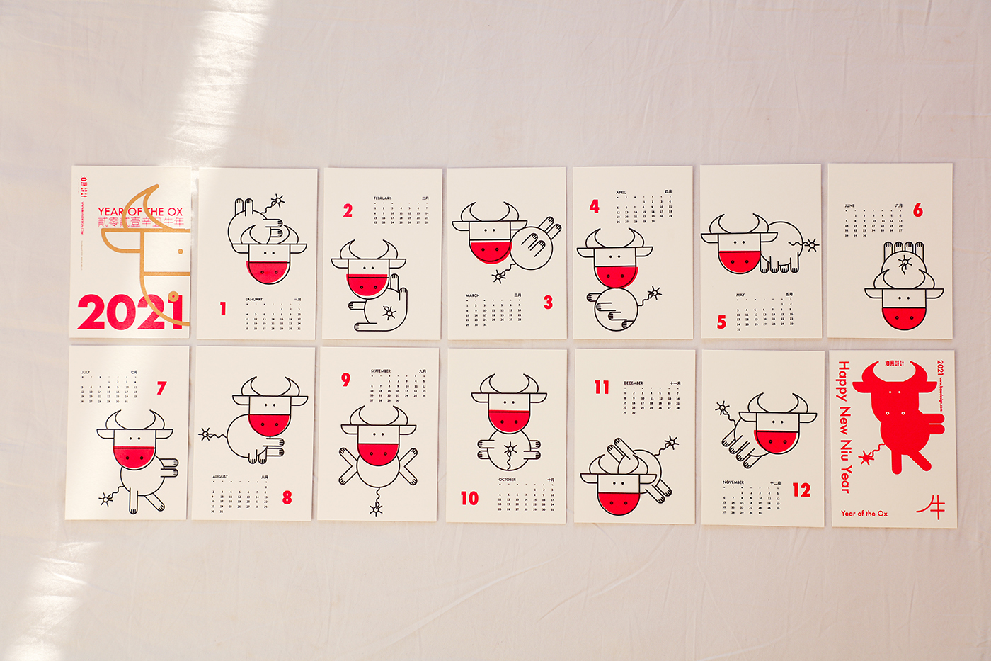
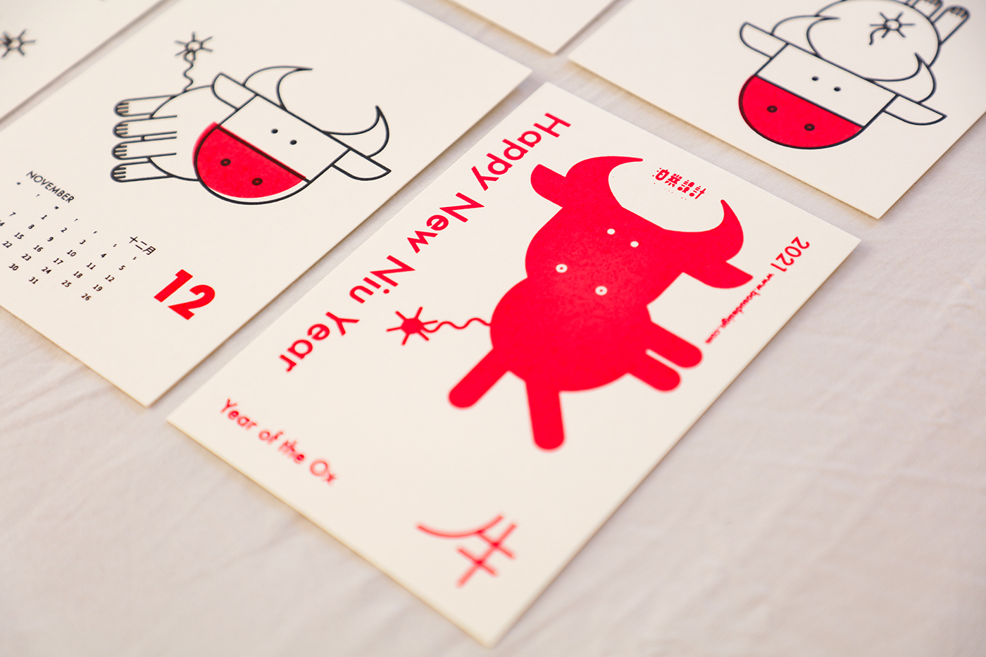
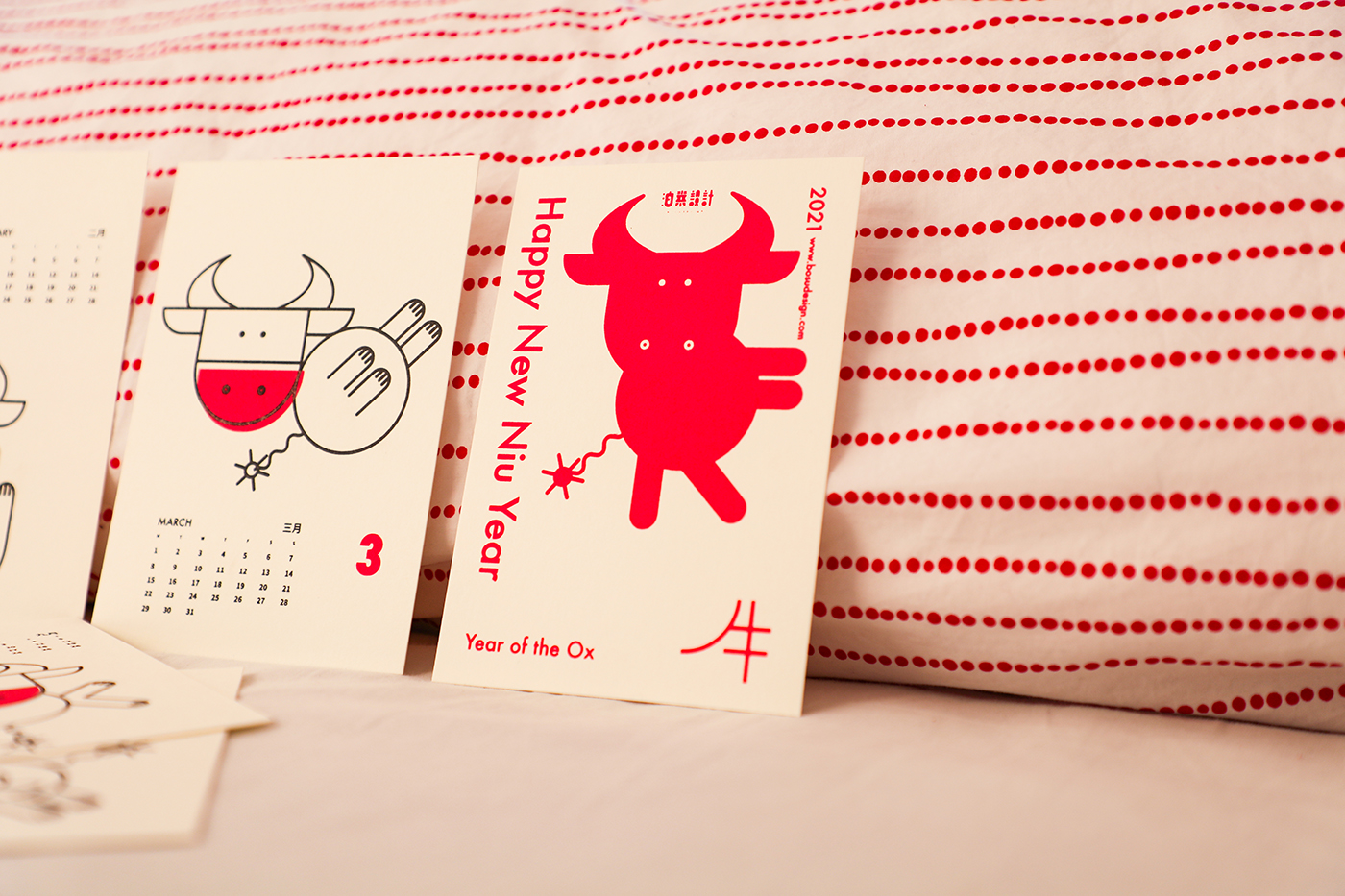
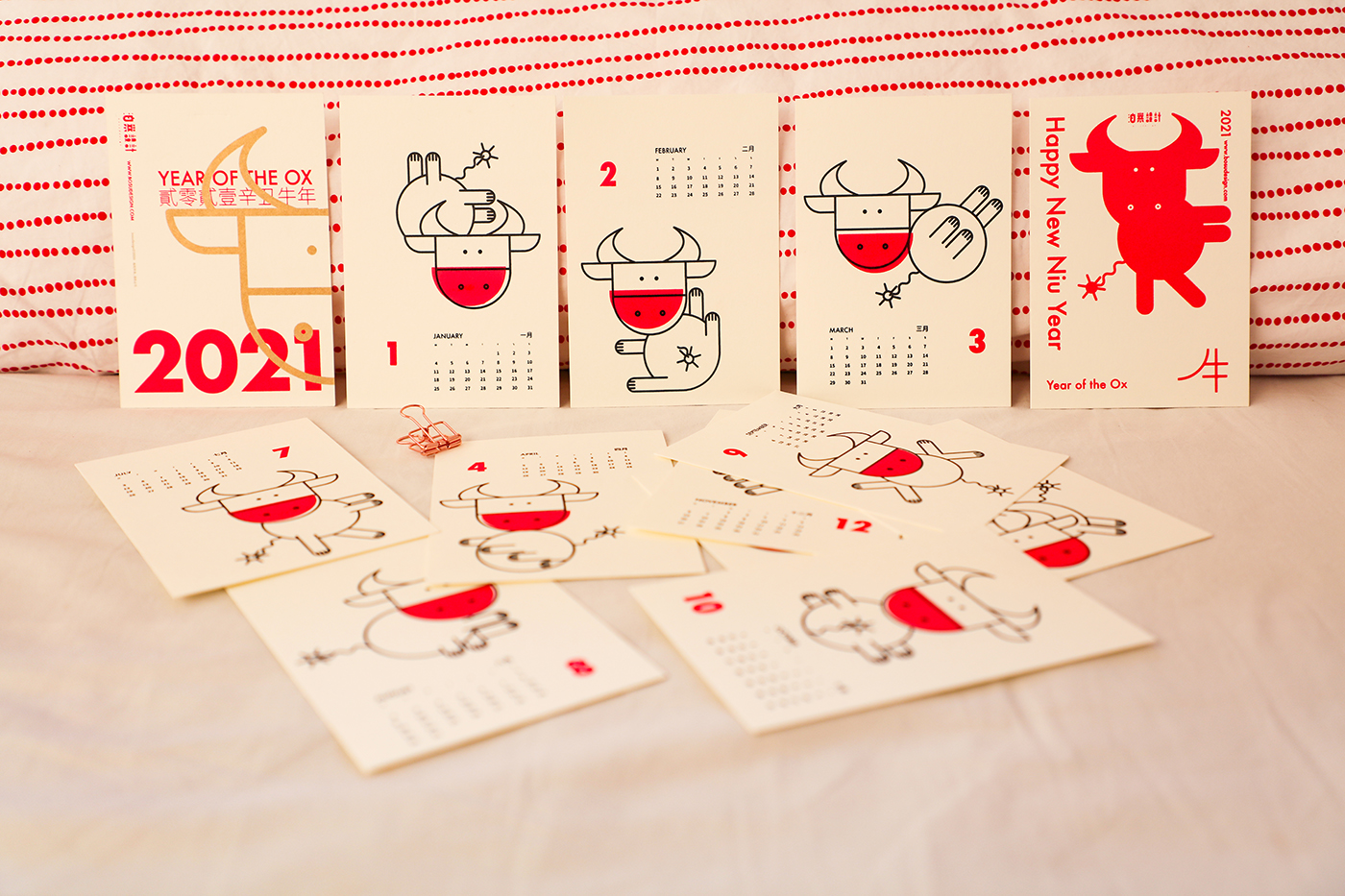
On a practical note, I produce only small quantities, so I can’t afford to have a professional printer mass-produce them (though I hope to one day). And I refuse to settle for the cheap, flat look of quick-print shop copies. So I do everything by hand: buying paper, cutting it to size, exposing screens, squeegeeing ink, drying prints, and packaging them. The joy of creating with my own hands makes all the hard work worth it. When my design finally comes to life on paper, every bit of effort melts into pure satisfaction.
 
The first person who showed interest was Brother Yan from DKPress, whom I visited after moving to Kunming last year. He couldn’t wait to buy a set even before I finished printing—truly touching. Initially, I’d hoped to collaborate with him on a joint project: using his Heidelberg Little Monster press for letterpress printing on 500g cotton paper, which would have a luxurious, tactile feel. But Yan’s health issues forced me to abandon the plan. I hope we can create something fun together in the future.
 
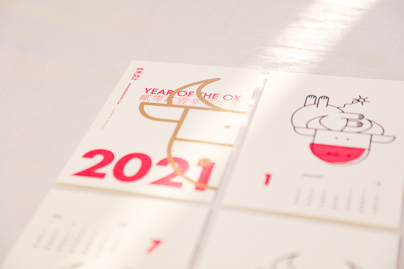
This year, I printed 40 sets as gifts for friends across the country. I hope the pandemic hasn’t dimmed their creative passion or made us lose touch with one another. May 2021 bring all of us good fortune in every way.
 
Written in Kunming.

发表评论

您的电子邮箱地址不会被公开。 必填项已用*标注