2025 is the Year of the Snake in the Chinese lunar calendar, and it marks the fifth year of our studio’s screen printing project. Every December, we launch this project and plan to complete a full zodiac cycle.
Q1 — What are the features of this calendar project?
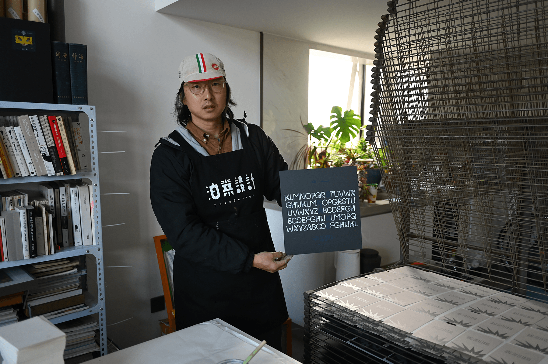
It exclusively uses screen printing techniques and does not involve commercial printing houses. Apart from the screen-making being outsourced to a vendor on Taobao, all printing is done in-house. Each calendar requires 29 printing passes (three spot colors overprinted), and completing all 100 copies involves nearly 3,000 manual prints, taking about 48 hours to finish.
Paper is either purchased individually or sought through sponsorship—it must be paper I consider good. Since 2021, I initially bought the paper myself, sourcing from German Gmund, ColorPlan, Mingsheng, and Italian Fedrigoni. Starting in 2023, Fedrigoni provided paper sponsorship. This year is no exception; Fedrigoni has sponsored all the paper for the third time. My heartfelt thanks go to them.
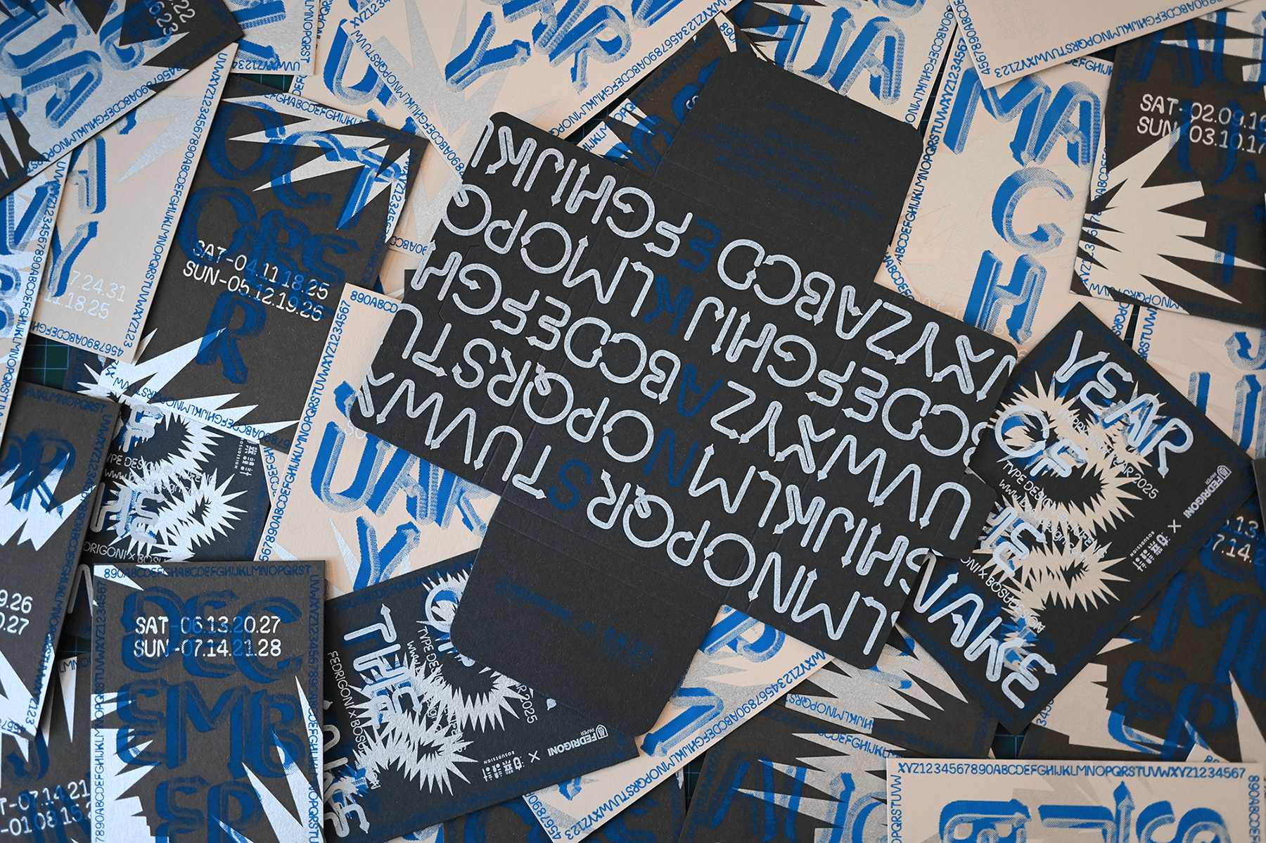
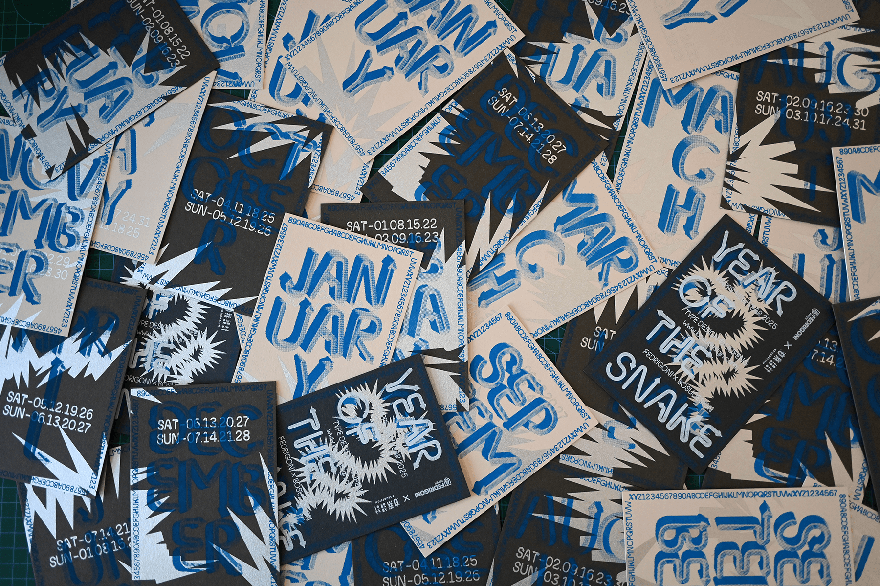
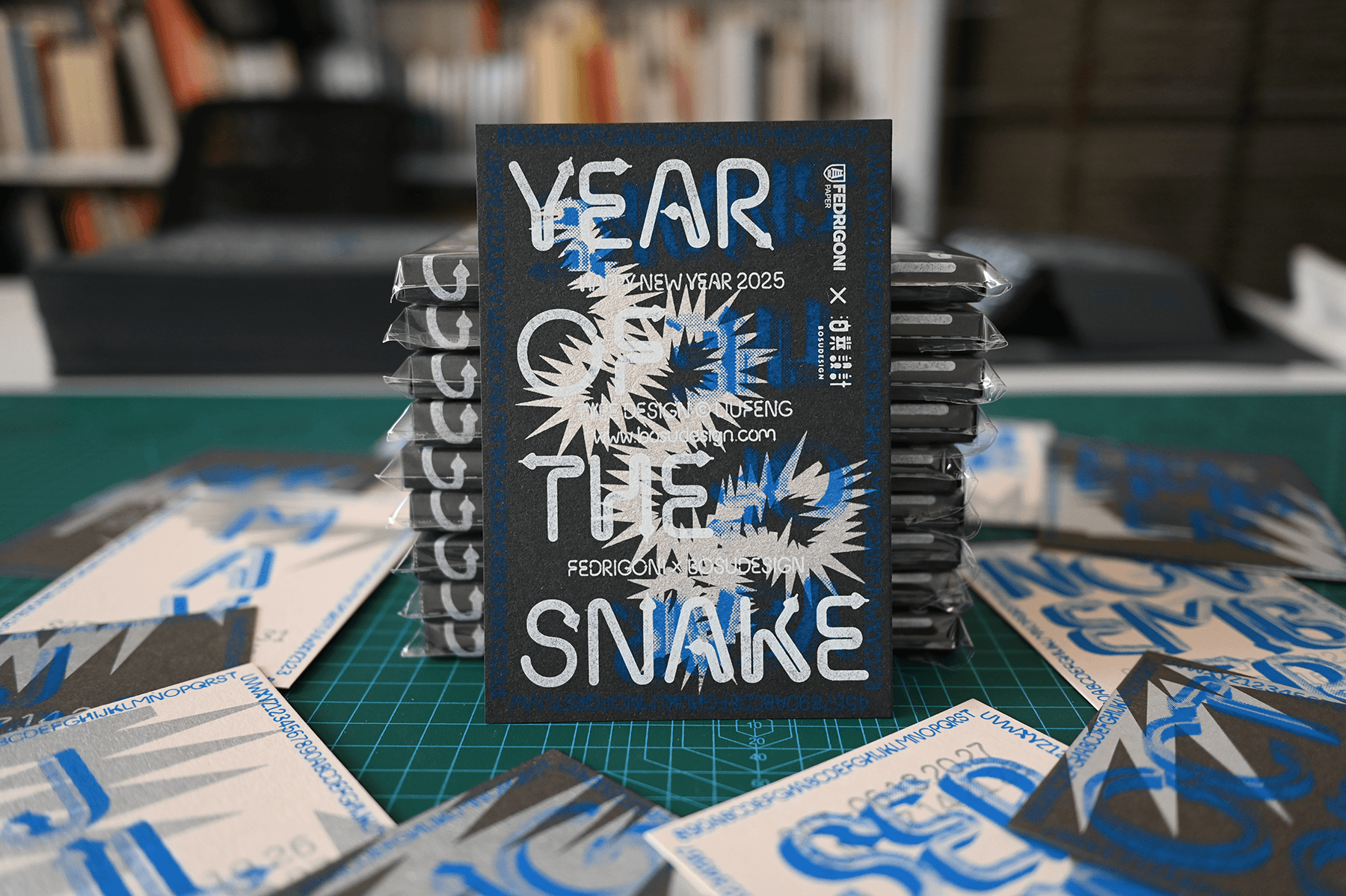
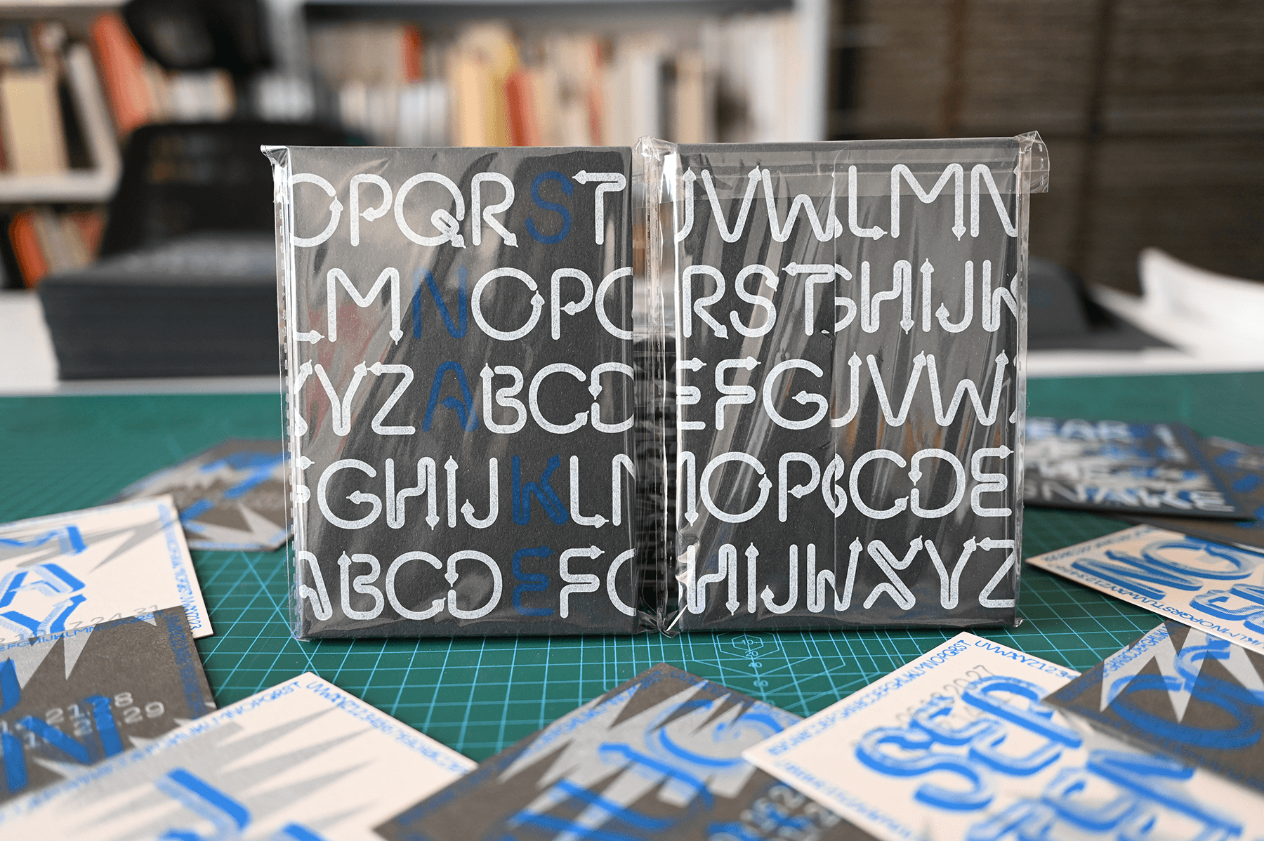
Each calendar consists of 13 cards plus a sleeve: one cover and 12 monthly cards, one for each month. The size is fixed at 100 × 145 mm, the size of a traditional postcard.
The design is guaranteed to be original every year.
Q2 — Why do it this way?
Screen printing uses the same spot-color inks as industrial printing presses, offering a much better texture than digital printing. Since I only produce 100 sets a year, the high costs of commercial printing houses are prohibitive. Moreover, during my studies in Germany, I learned screen printing techniques and am highly proficient with them. This approach also eliminates the need to purchase printing machinery—a single table is enough to get the job done.
Paper is the soul of the material. Without good paper, there can be no good print.
Keeping the size consistent imposes a constraint, but design thrives on constraints—it’s like dancing in chains. I plan to run this project for twelve years and, at an appropriate time, hold a retrospective exhibition.
As a graphic designer, I spend most of my time serving clients. This project allows me to be my own client—essentially transforming into an artist, creating freely, and expressing myself without restraint. It feels wonderful.
Q3 — About the design and printing techniques for the 2025 Year of the Snake:
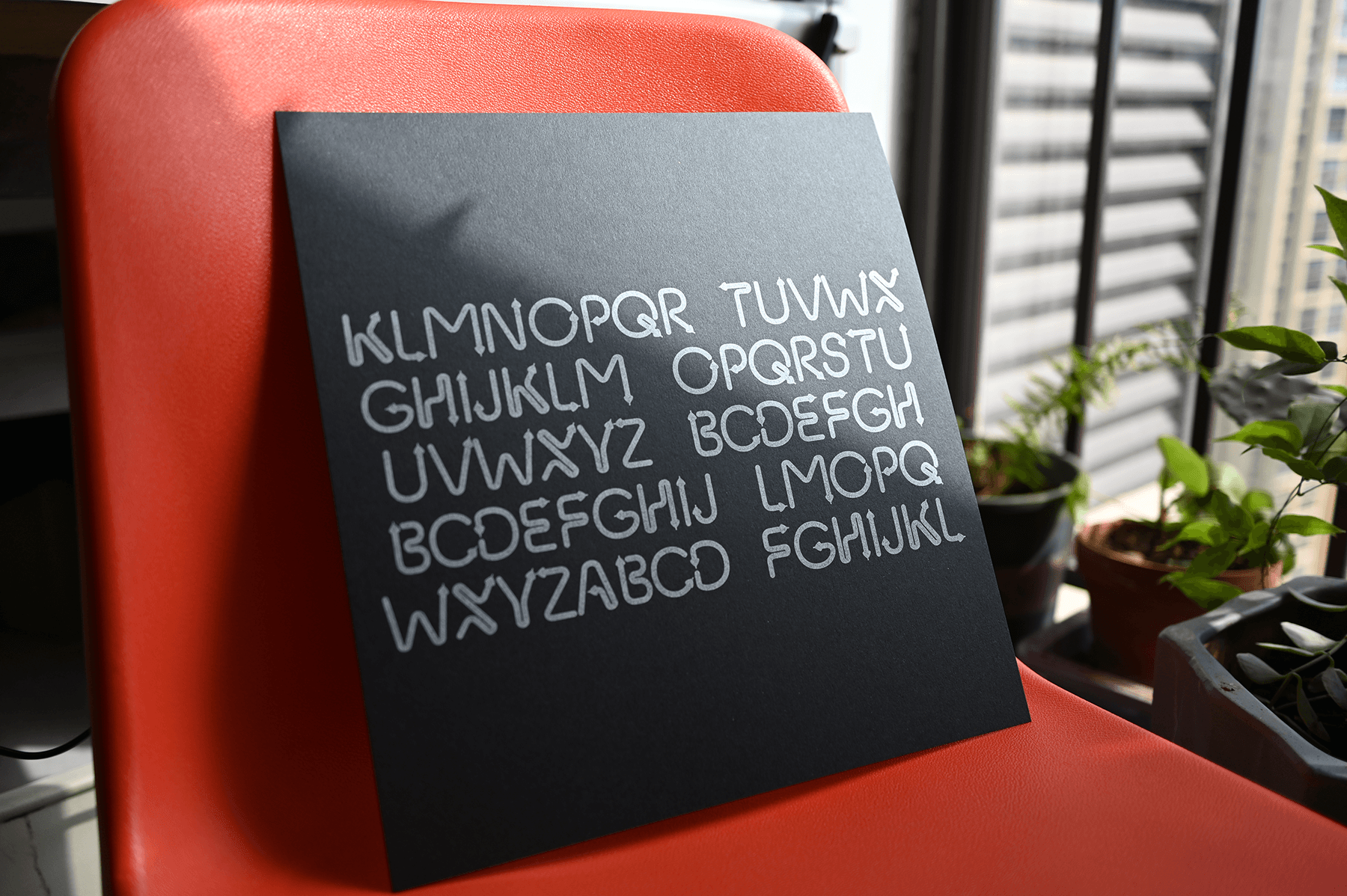
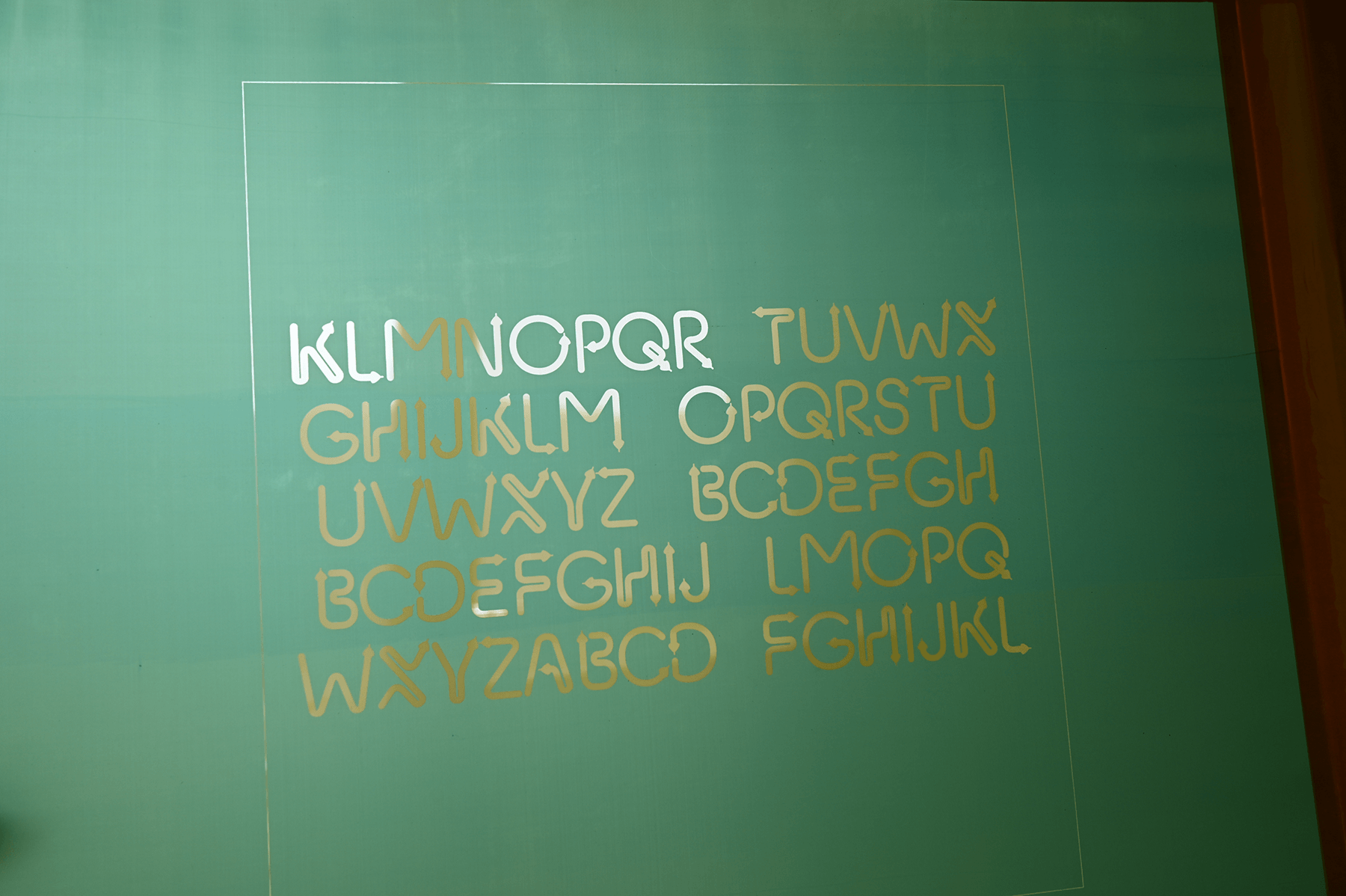
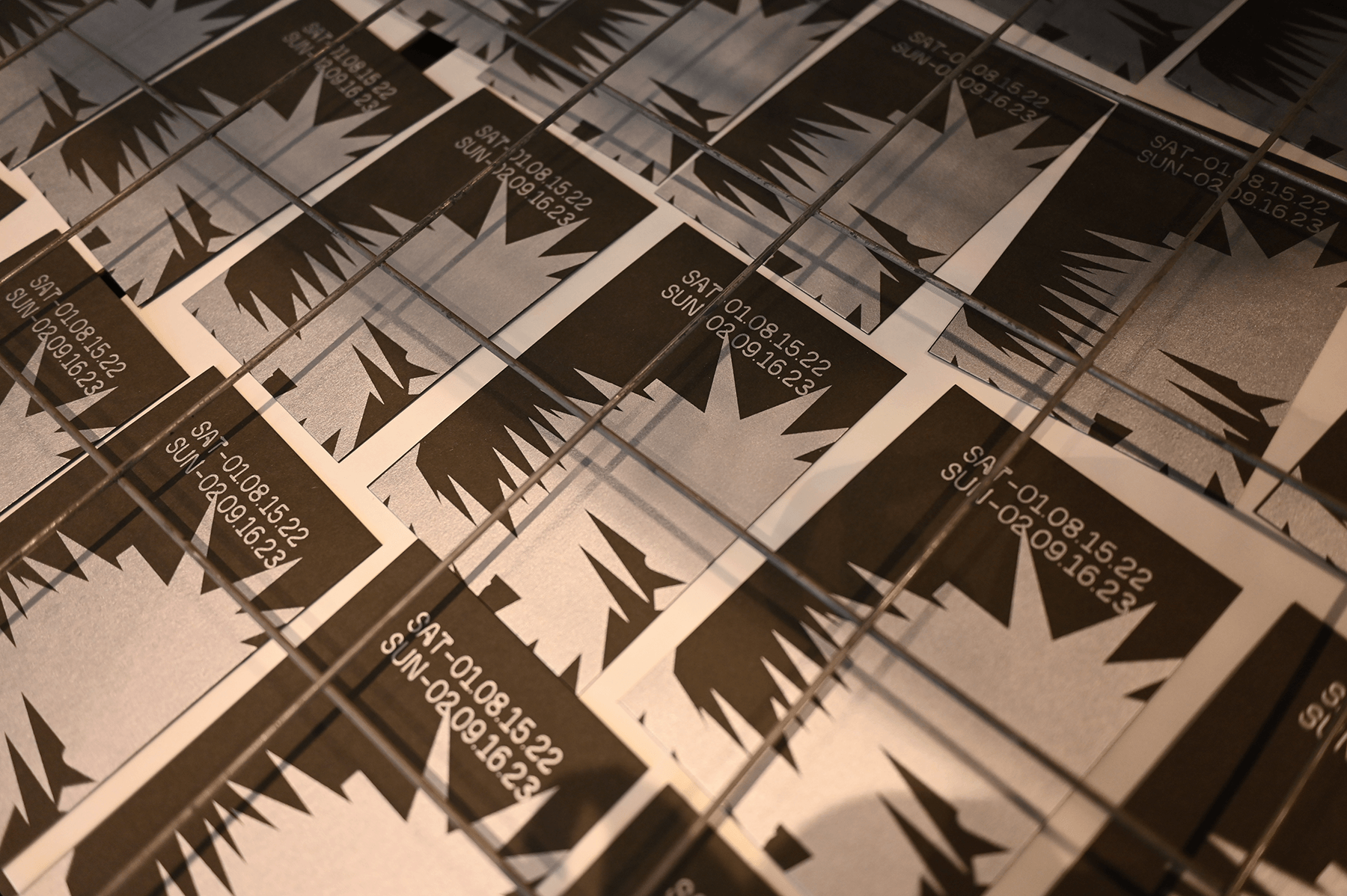
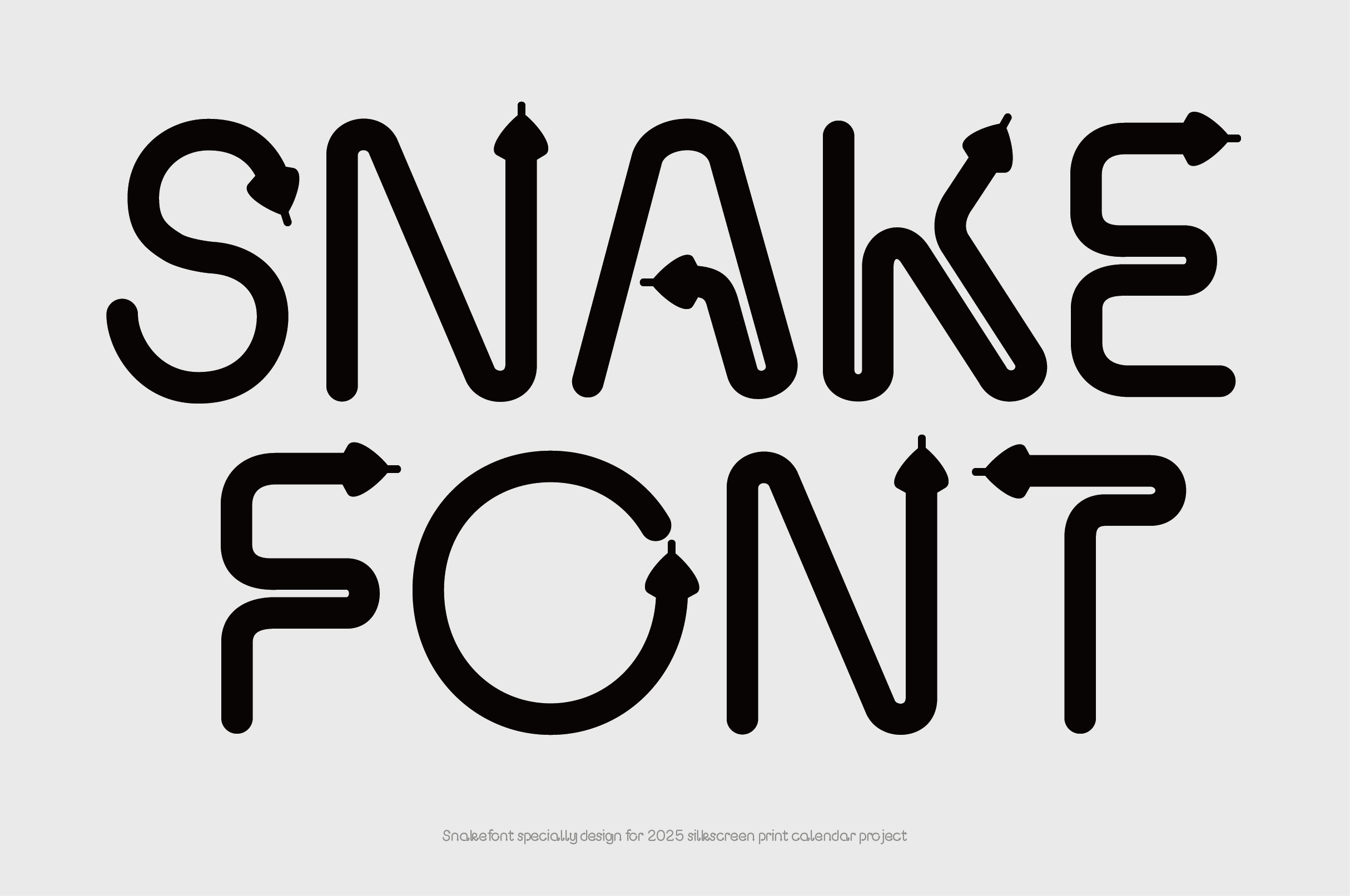
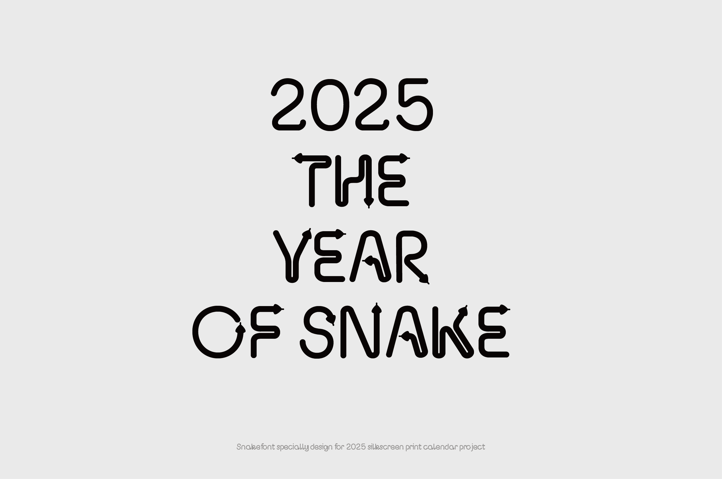
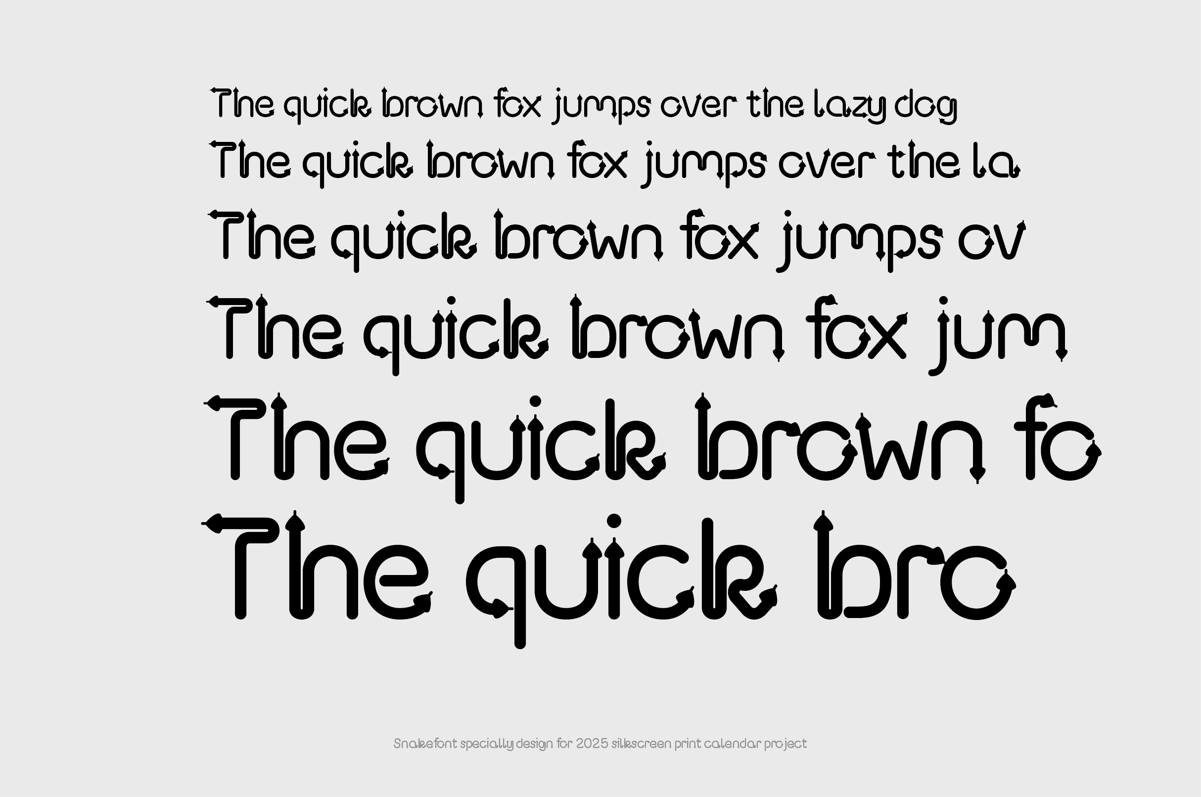
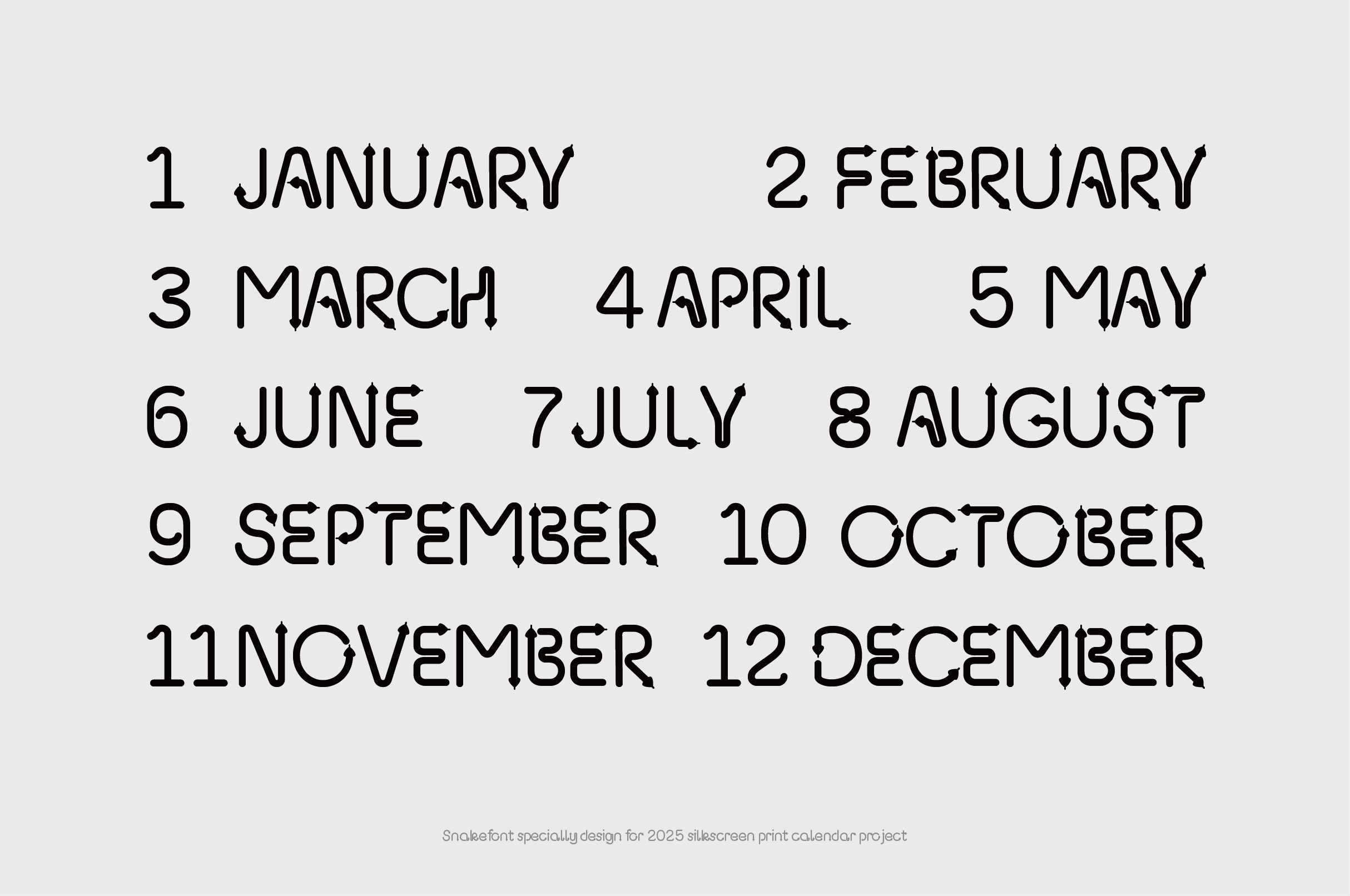
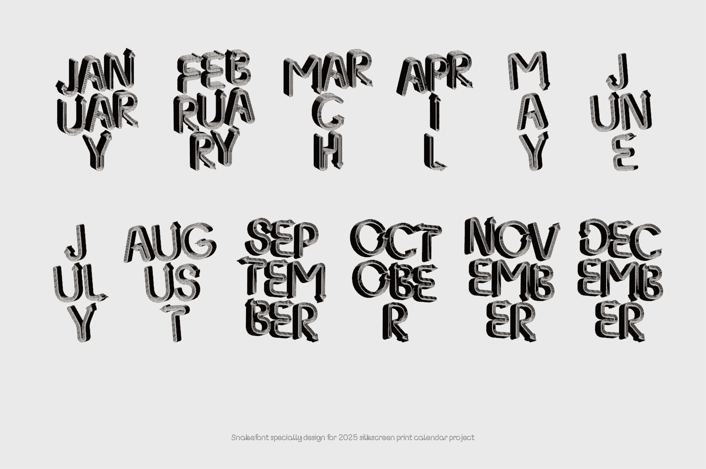
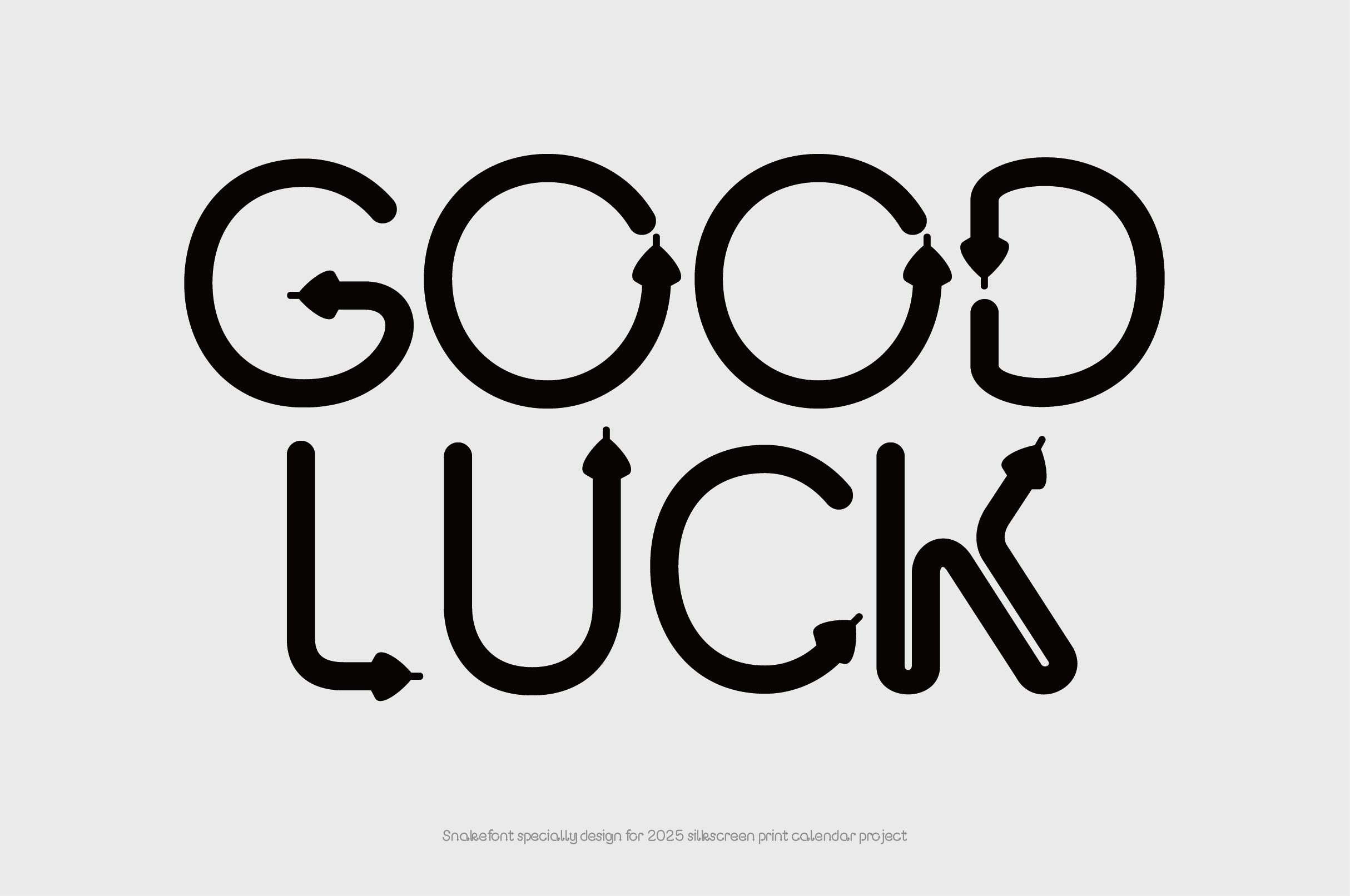
The design for 2025 is quite distinctive. The main reason is that I couldn’t come up with any interesting ideas for depicting the snake, and I didn’t want the design to be too ordinary or homogeneous. Ultimately, I designed a set of Western typefaces themed around the “snake.” Through typography and layout, I convey my understanding of the Year of the Snake. The design of the sleeve pays homage to the poster for Erik Spiekermann’s exhibition at the Bauhaus Archive in Berlin. If you’ve seen it, you’ll surely remember the classic design where he used typefaces he had designed to spell out his name. As for the months, they still only include Saturdays and Sundays—work is exhausting enough, so I want my calendar to be filled with beautiful weekends; let weekdays from Monday to Friday go to hell! As for the graphic design of the snake, it’s a squiggly, explosive line. Snakes often evoke a sense of venom and intensity—I printed it on the bottommost layer to minimize that impression. To enrich the visual layers, I used this typeface for the month names, giving them a three-dimensional form, and applied halftone effects to create gradients with a single color. This technique works very well with spot-color printing and is the first time I’ve used it in this project over the past five years.