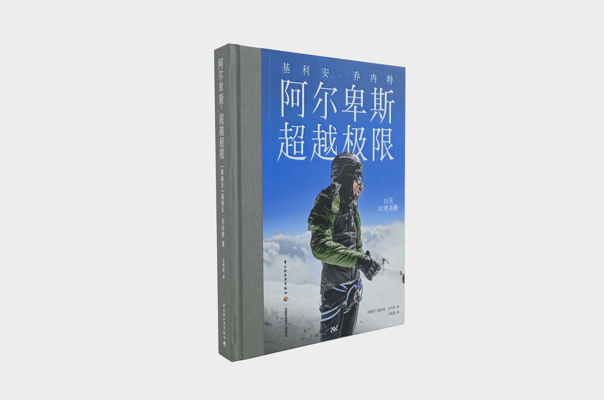
In early 2026, BOSUdesign was invited by Li Zhiqian of 3Type to design the Simplified Chinese edition of Alps, Beyond Limits, a book about Spanish trail runner Killian Jornet. The client commissioned a complete book design, not merely a cover or interior layout.
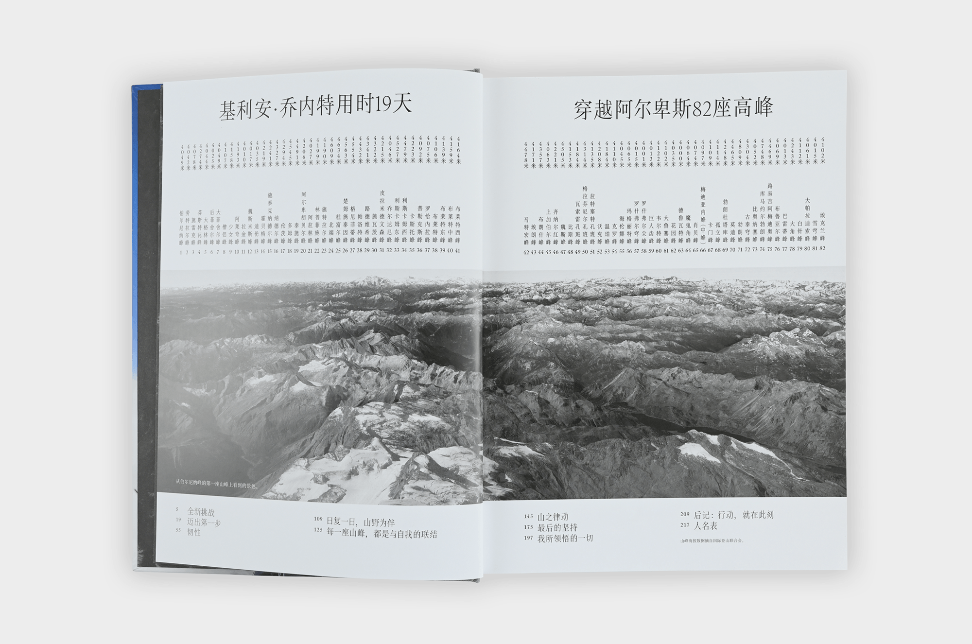
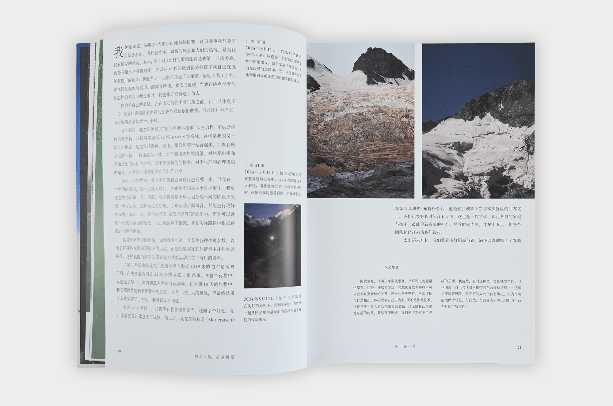
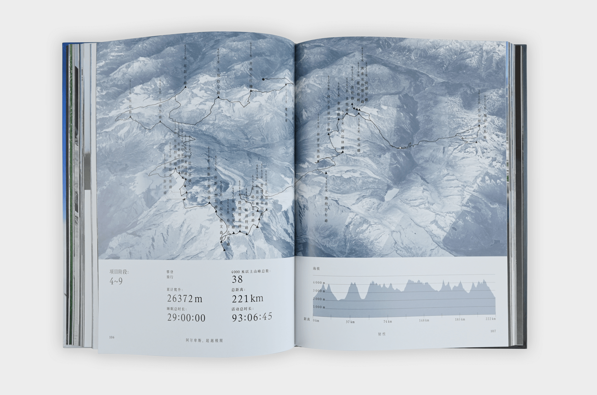
The original editions—Catalan and French—were 16-mo hardcover volumes. Each interior page was divided into six columns: four near the fore-edge for body text, two near the gutter for captions. The type area was full, with very narrow margins. The original used the Rhymes type family from Swiss foundry Maxitype, a contemporary interpretation of the undigitized Times New Roman. The Text series was used for body text, the Display series for headings, and five condensed variants were custom-made for the brand.
The Chinese edition followed five steps: analyzing the original, selecting Chinese typefaces, testing layout, presenting to the client, and cover design and printing.
For typeface selection, the client’s proposed Boya Song, Lanting Kansong, and Songyuan were all unsuitable. After comparing Fangzheng Lanting Song, Source Han Serif, Hanyi Xuansong, and others, the team chose Songjian Regular for body text, Source Han Serif for punctuation, and Rhymes for Roman letters and numerals. Since Chinese typefaces lack condensed variants, the team compressed the body text horizontally to 96% to match the original’s tall, narrow character. Margins were adjusted from 8 mm to 12 mm to suit both handling and Chinese reading habits. Body text was set at 10.02 pt with 8.2 pt leading.
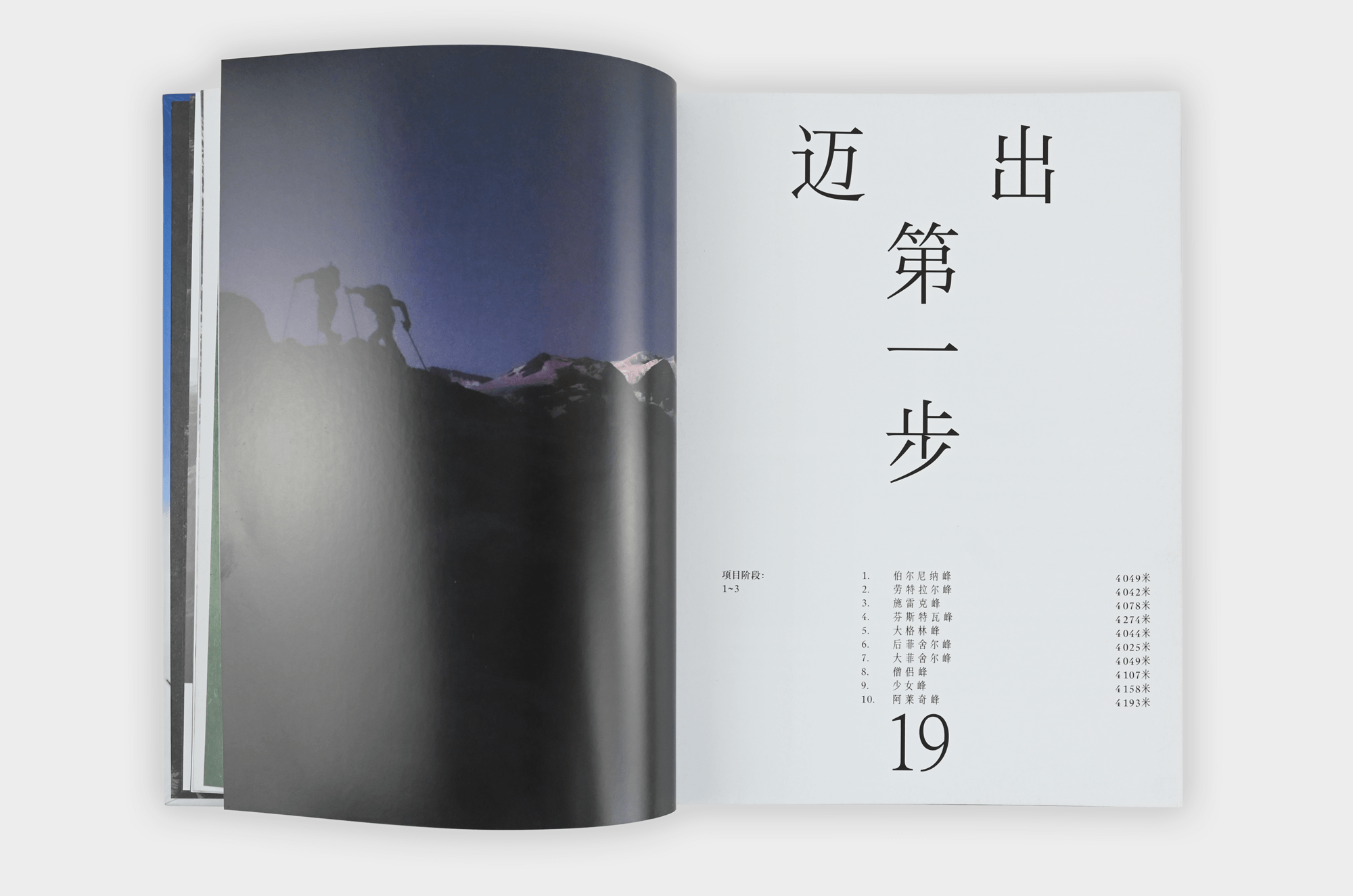
The highlight was the custom design of over 500 Chinese characters for the title, chapter headings, and quotations, created by Li Zhiqian and Li Zhenfeng. Although the original design studio, NAPO PEOPLE, does not read Chinese, they offered three rounds of detailed typographic feedback, which the team either implemented or explained why they could not.
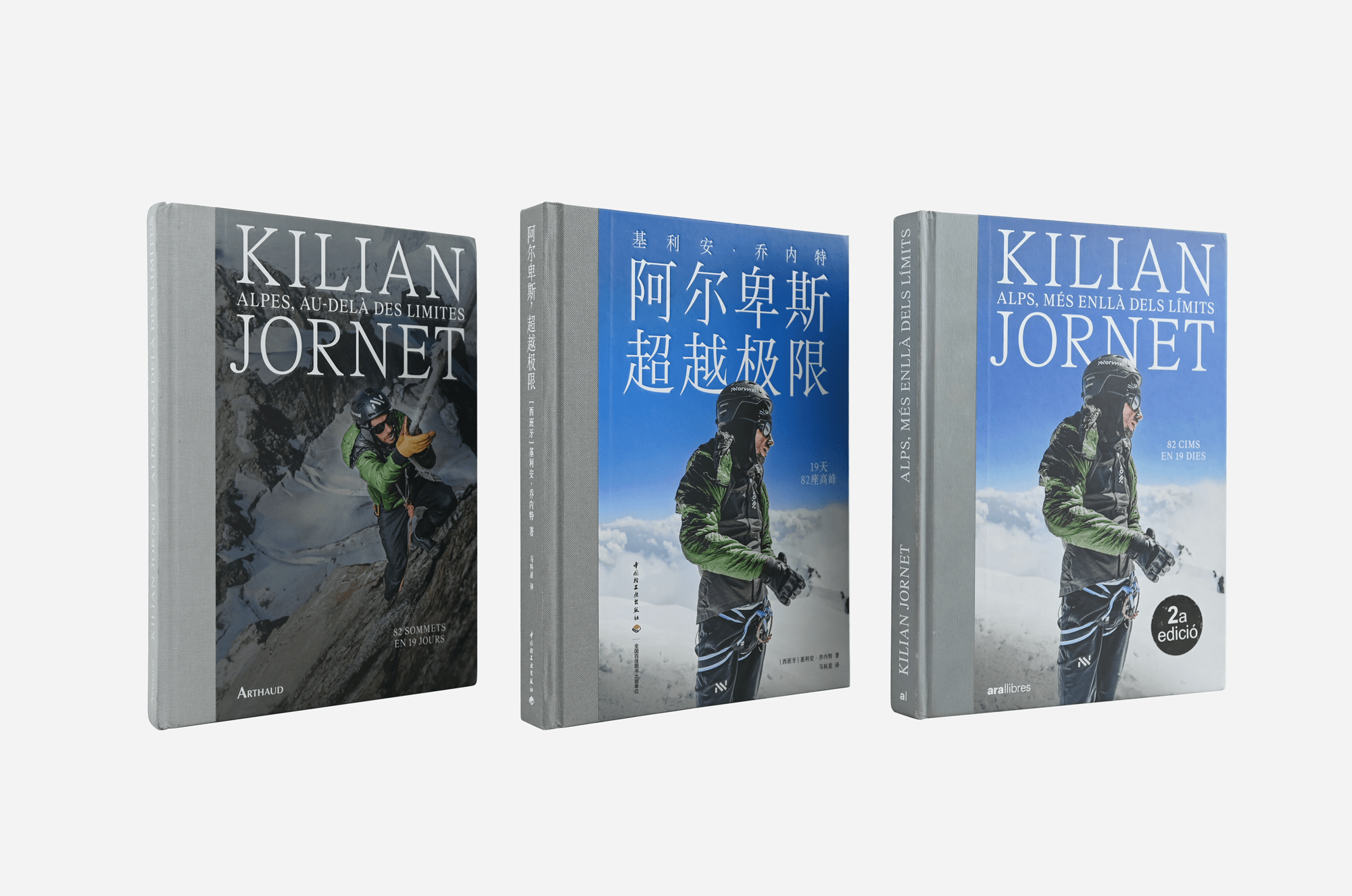
After multiple discussions, the cover was finalized with Alps, Beyond Limits as the main title and Killian Jornet placed at the top. The book was printed by Yutong Printing in Tianjin, with a print run of 3,000 copies, priced at 128 yuan, published by China Light Industry Press in August 2026.
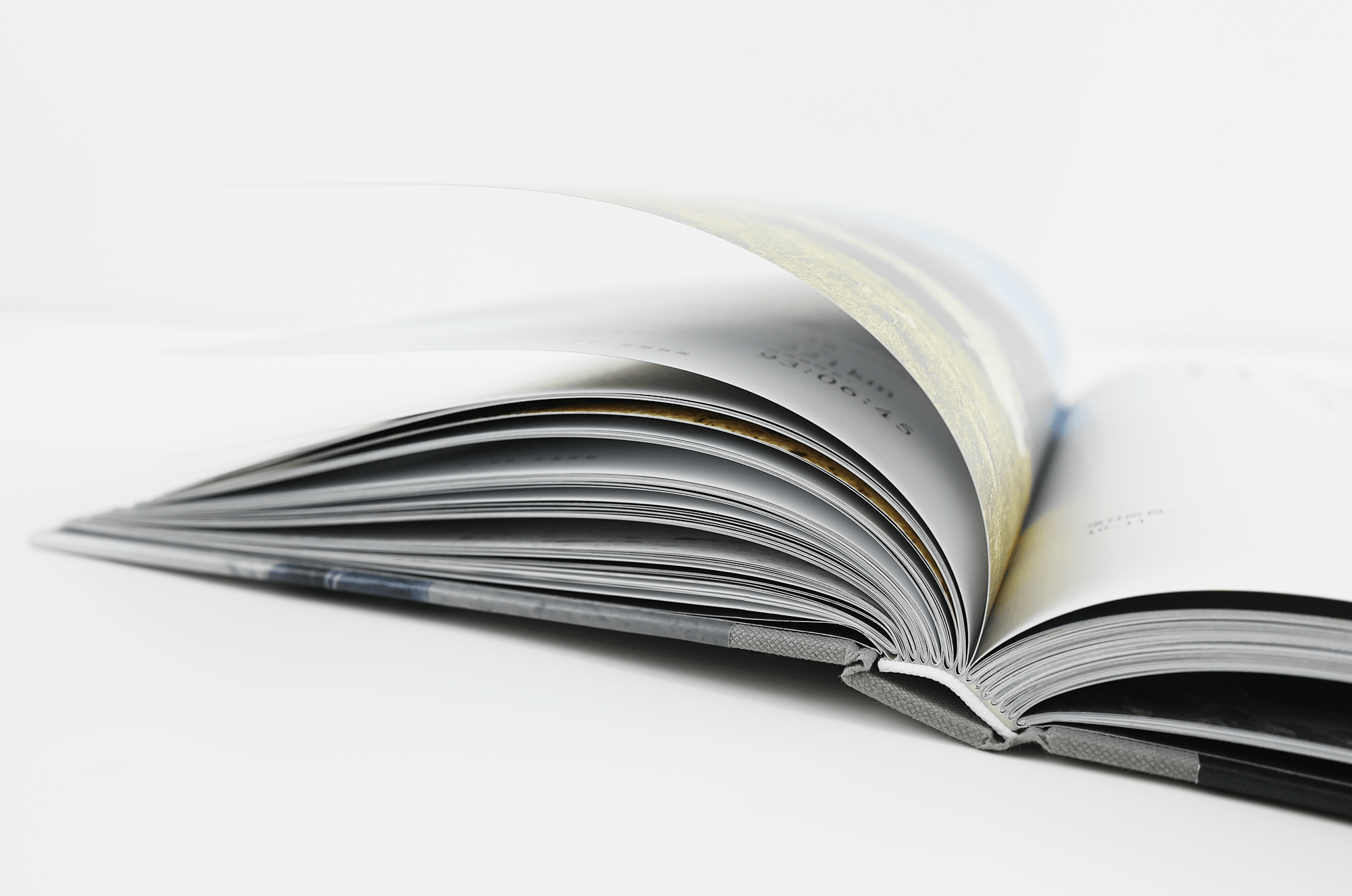
The project embodied Lü Jingren’s concept of “holistic book design”: from typeface selection and custom font creation to typesetting and printing, forming a complete process. The team believes that regardless of language, typography has general rules and reading habits, and that mutual learning and exchange are the only ways to progress.